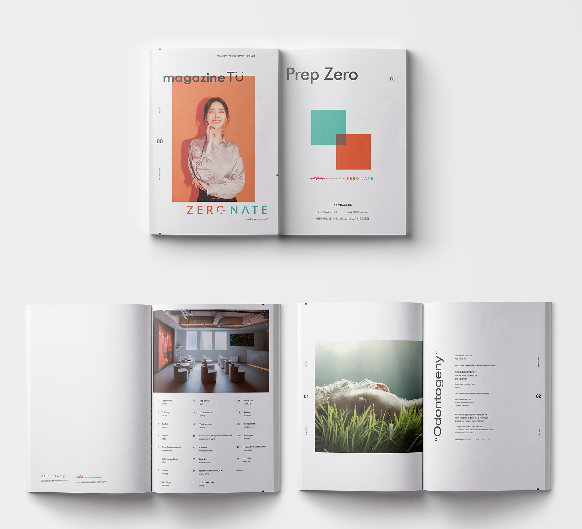

내부에 방문하는 고객들이 보는 용도로 제작되었으며,트렌디한 내부 인테리어에 걸맞은 잡지 스타일의 디자인입니다.병원 브랜드의 아이덴티티를 느낄 수 있도록 표지 디자인에 병원 퍼스널 컬러인 주황색을 사용하였습니다. 내부는 유행에 민감하지 않도록 전체적으로 미니멀하게 구성하였습니다.
It is designed to be seen by customers visiting inside, and it is a magazine-style design suitable for trendy interior design. To feel the identity of the hospital brand, we used orange, which is the hospital's personal color, in the cover design. The interior is minimalized so that it is not sensitive to trends.